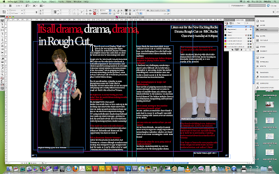
i started my feature page by creating a heading. i played around with the positioning of the heading and using the tracking tool which makes the text closer and either increase or decreases the amount of space between each letter which I made the letters close together. The colour scheme I used was Red, Black and white just like my poster. Which I made my own colour swatch of the Red using the swatches tool on the right hand side and clicked on new colour swatch.
I Then decided that i wanted my background to be black because of the feature pages i analysed they all has used white background so i challenged this and decided to be different. i am doing my feature page on Vivienne so i added a photo , i used the the quick selection tool to highlite around the image to cut around his body.if i didnt cut completely around it, i used the Alt button to deselect an area, once i got the image perfect i refined the image by changing the radius and smoothing image. i am now going to add my article and interview to the feature page.
 I added in my article which i broken up the text by the interviewer being in the red and the person being interviewed in white text which made the poster stand out but also made it clear and understandable. i also made changes to the heading by using commas to make the sentance more clear and correct instead of using ...
I added page numbers and the title of the magazine at the bottom which was the radio times i used radio times to follow the forms and conventions of radio dramas. i added in a image in the middle of my interview/article to follow the forms and conventions of the magazine ELLE which i researched and decided to follow as it breaks up the text and makes the feature more interesting.
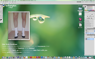
 I used the following image of showing stephen (Vivienne) in heels to create comedy to the interview and make it panto style as in the article i made Stephen look like a fun guy rather than the guy he plays on air Vivienne who plays evil. i only cropped the image as the image was quite bright, i didnt cut around the image as i thought it would not look right on my feature page although this image looks like it was took in the studio.

No comments:
Post a Comment